What Should the Top 3 Minimalist Office Design Examples Be Like?

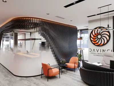
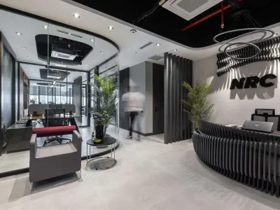
Office design has become a frequent brief on both a corporate floor and a small-team office. A modern language is the first answer many people reach for, yet many founders prefer a minimalist office: few pieces, a clear surface, a warm but calm work area. This article does not rank three “best” looks; it examines three decisions that hold on a tight floor. If you want the office in that language, furniture, colour and light belong in the same file.
1. Furniture That Fits the Job
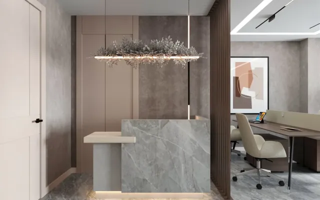
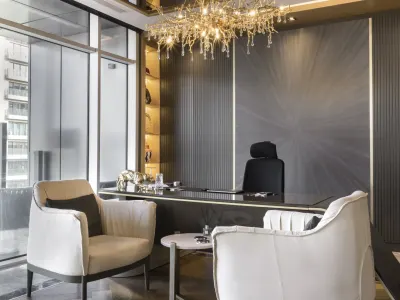
In a minimalist office, furniture takes little floor area and still does more than one job. Surplus that tires the eye and shrinks the room is taken out. The desk stays linear and its top stays clear; papers sit in a closed cabinet. Desktop organisers are not multiplied to hide clutter — a few pieces that are actually used are enough. Chair and storage follow the room layout; seating comfort is not cut so the room “looks empty”.
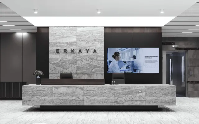
Current project: Leather Concept


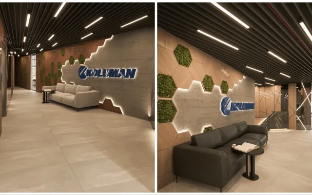
Deriden Concept
2. Colour Chart and Texture
Colour does not hide a small office’s floor area; it manages light and the edge of the room. The palette stays calm; chair texture — wood, felt, linen — adds depth. A “dazzling” chart breaks a minimalist plan. If a rest corner is wanted, the answer is not a hammock or a sun lounger; it is one seating piece that matches the office language. The furniture’s form should not fight the room layout.
3. Lighting and Accessories
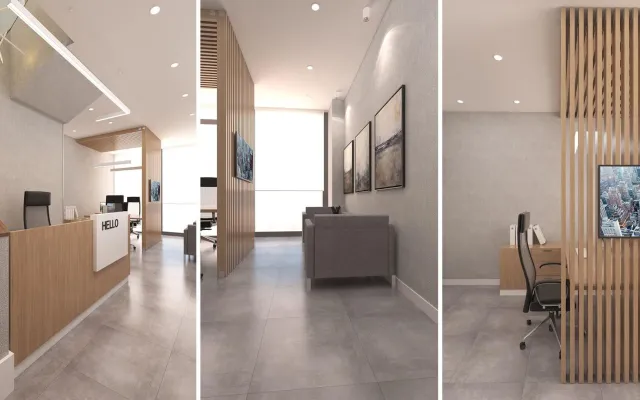
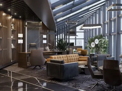
Daylight is the first source in a minimalist office; artificial light in a near-daylight tone completes it. Accessories stay few. On the walls, one large work reads better than many small frames. If light comes from the side planes rather than only from above the desk, screen glare also drops.
To read five concepts as criteria, see office design concepts.