How should dark color office design be?
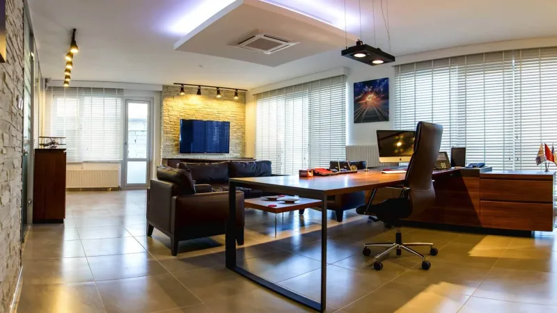
Colors in life contribute greatly to psychology, human energy and productivity. Therefore, it is important to pay attention to the colors used in work areas to ensure high efficiency from employees. The importance of color in office designs has increased day by day. How should a dark color office design be? What are the appropriate colors in office designs for employees? It is among the topics that have been widely wondered about recently.
With new regulations in office designs, many issues from lighting to natural light source are carefully planned. There are factors that directly affect customers and employees that need to be taken into consideration in office design. The first of these is colors. The importance of colors in office designs is a very noteworthy issue. Because colors are concepts that have the power to enlighten people's inner world and increase their productivity. However, it should be taken into consideration that it may also have negative effects on humans. That's why the importance of colors in office designs should never be overlooked.
Which colors can be preferred in office design?
The combination of colors in office designs and their placement within the office varies depending on the type of office design preferred. Different colors and densities are preferred in modern office designs and different colors and densities in classical office designs. In addition, office colors are chosen based on the emotions and feelings that are desired to be dominated in the office by using the language of colors.
For example; The colors to be used in an office where liveliness and productivity are desired are mostly colors and shades such as blue and green. However, in offices where positive attitudes are desired, designs are created using blue and green colors.
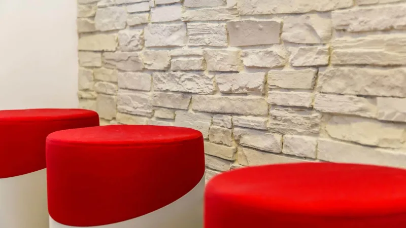
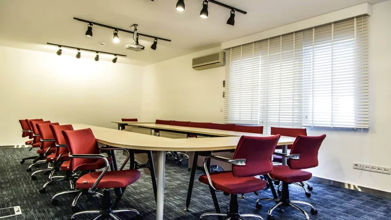
In offices where the color red is preferred, attention and perception are prioritized. It is known that red, the color of blood, increases blood pressure and thus expands perception waves. Employees in offices where red is preferred, which is also said to be good for psychology, work more carefully and attentively.
To give an example of the negative language of colors, purple is not preferred to be used in office designs. The use of the color purple, especially in men's offices, makes employees depressed. This may cause work disruptions and productivity to decrease.
Current project: Office Building Design
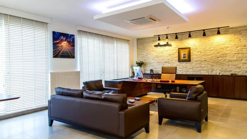
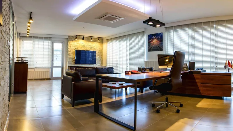



Office Building Design
How should the dark colored office design be?
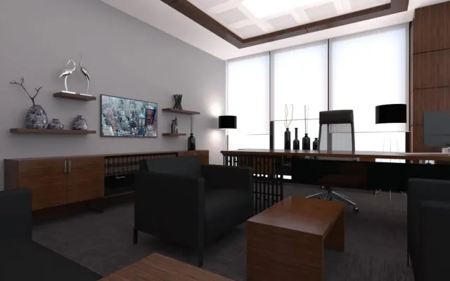
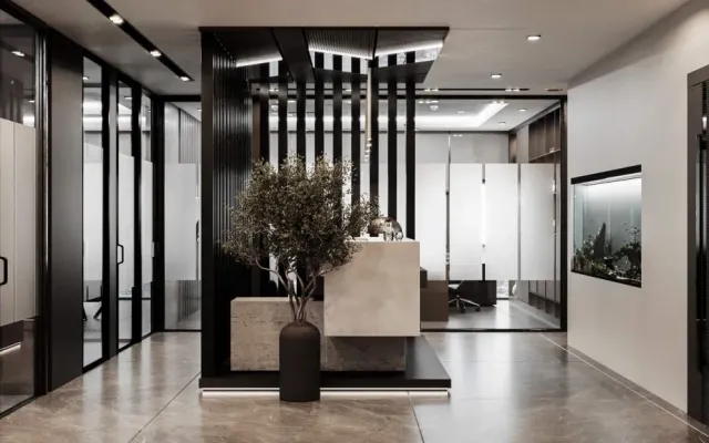
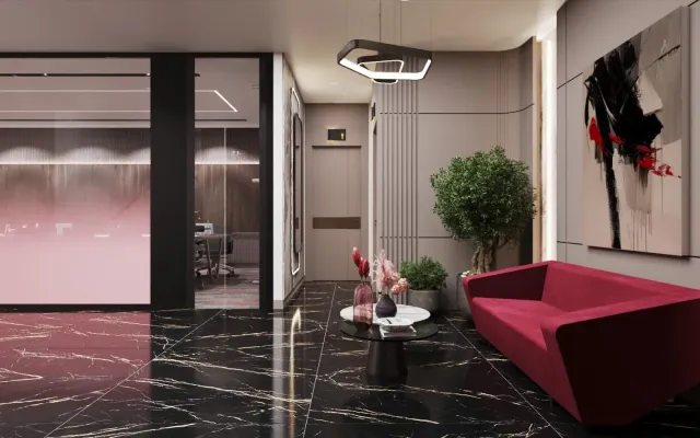
The preferred colors in dark office design examples are generally dark blue, which is the color of nobility. In addition, the color black, known as the color of competition and ambition, is also frequently used in dark office designs.
The answer to the question "How should a dark color office design be?", which is frequently researched by those who want to design their office with dark colors, is also hidden in the colors. Office design with dark colors is quite difficult. Because it is very difficult to distribute dark colors throughout the office, paying attention to their combination and intensity.
There are some points to consider in dark colored office designs. The first of these is to pay attention to the harmony of colors. Proper harmony of dark colors will also increase the effect of dark colors intended to be used in the office on employees and customers.
However, the areas of use of dark colors are also very important. While black is known as the color of ambition and competition, dark blue is known as the color of nobility. It will be much more useful to adjust the colors according to the language of the areas in the office.
You can click here forRelated Posts
Is Carpet Used in an Executive Office?
Executive Office Design Examples
Modern Office Design Ideas
Office Design Examples