Executive Room Color Selection Guide: The Art of Coloring Your Office

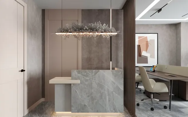
Colour choice in the executive room is several layers read together. The room should match the atmosphere of the office and the rest of the finishes. A decorative piece can open to the executive’s taste; it should not break the diagram.
Furniture and colour change how the room works; the claim that they “directly affect working principles” is not written. An interior architect’s view helps the choice list. Focus and tiredness are read through contrast and glare. Those details are written before the palette.
Which Colours Belong in an Executive Room?
Colour has an effect on people; no tone has a fixed meaning. The room palette is built by reading association and office language together. A line that does not tire the eye and matches the wider design helps in a workroom. The room is analysed for its energy; a rise in output is not promised.
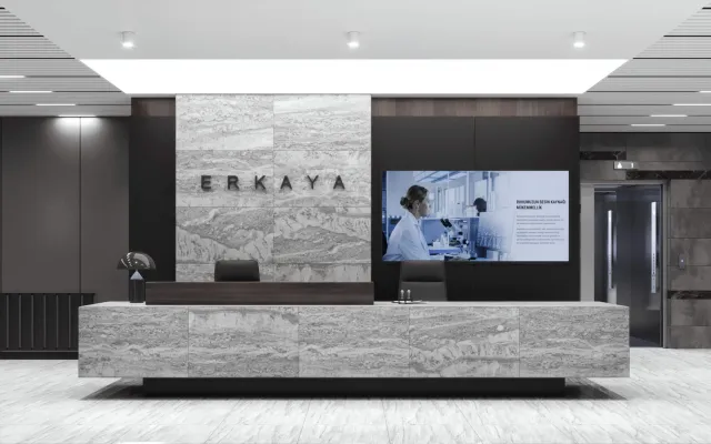
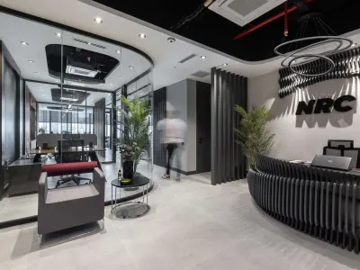
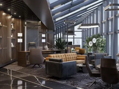
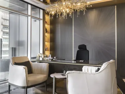
Dark and light tones are common in this room. Black is associated with competition and drive; that is a reading, not proof. A surface that reflects less can cut glare at a screen. White is associated with simplicity; on a large surface it can feel cold. As Umut GÜRLER Interior Architecture - Ankara Interior Architecture we write light first at survey, then the palette.
Current project: Eastern Hotel, Tehran


East Hotel, Tehran
How Colour Changes the Working Day
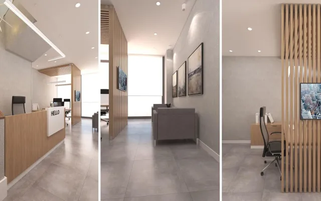
The physical look of the workroom changes the rhythm of the day. That is why a survey list is kept when colour is chosen. The tone is read with the lighting. A wellbeing claim is not written; tiredness and focus are judged.
It is not known that colours “directly affect” creativity and output; association is written. A palette that fits the work and the duration can make the day easier. Motivation and a contemporary look are supported by a careful choice; success is not inevitable. For the luxury layer see luxury decoration ideas for the executive room.