Color Psychology and Its Use in Office Environments

Colour psychology at work sits on every surface, from furniture to wall paint. If the effect of a colour choice on people is read with care, a coherent floor can be set. The colour of each element does not “directly” write output; still, it changes gaze and posture.
The colour of every detail, from the floor to an accessory, affects concentration. A manager who wants creativity and output does not pick a palette at random. There is research on how colours affect performance; this article does not use it as a ranking. Interior-design advice on correct use asks for light and the kind of work.
How Colours Sit With Human Psychology
A lot is said about colour in offices. Red is tied to arousal and caution; it is not claimed to raise heart rate on every wall. Blue and green are named with calm. The settling that follows that feeling helps some teams; it is not a guarantee of output.
The line “twice the output on a blue ground” is not kept in this article. Navy is often seen where formality is wanted. Yellow is named with an optimistic accent and with creativity; it does not force the whole wall to be yellow. As Umut GÜRLER Interior Architecture - Ankara Interior Architecture we write the rhythm of the work first at survey, then the palette.
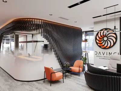
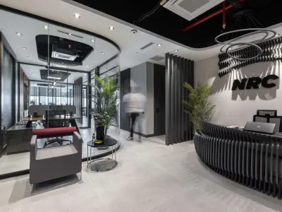
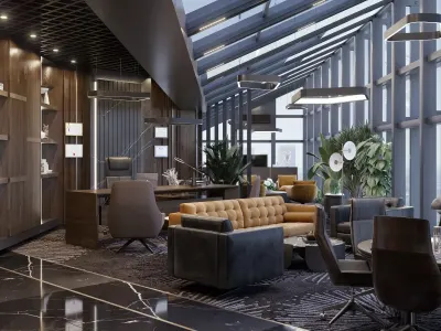
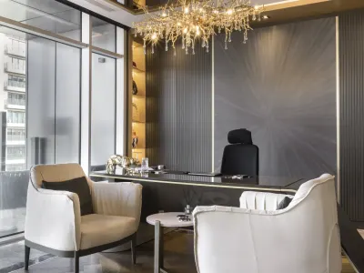
Current project: Okçuoğlu Construction Company Office Design


Okcuoglu Construction Company Office Design
Things to Consider When Designing an Office
Tools in offices and workplaces change quickly. Adapting to new technology matters for a fresh office; the palette does not write that fit on its own. Screen, cable and light sit beside colour.
To support creativity, colour, a personal area and acoustics are read together. A productive result does not come from the paint tin. An open bench is not enough for motivation; a short personal corner is also written. For a flexible floor that can test ideas see creative office spaces.