5 Stylish Office Design Ideas

Office design has many forms; young teams look for a language that fits the day’s work. In a client-facing workplace the look has to be strong — but strength is not only looking different. This article reads five office design ideas as options. They do not all fit every floor; which one works depends on the function diagram.
Where Office Design Sits Today
The office is where a new client meets you and where you stand next to a rival. A distinct language can become a need; still, an office that represents the brand is not a styling choice. It is holding the room layout and the welcome sequence. Continuity comes from a working plan, not from a shopfront.
Five Ideas Often Discussed
1. Greenery in the office
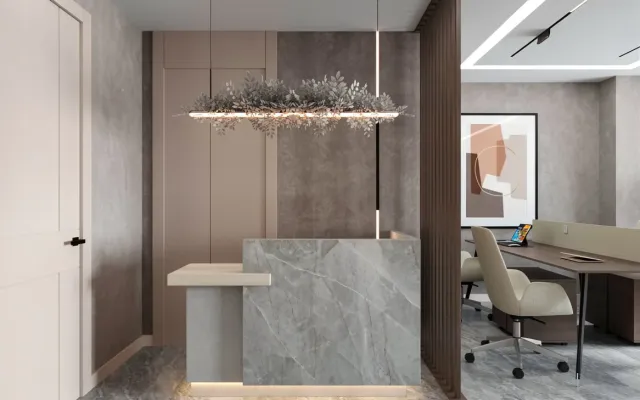
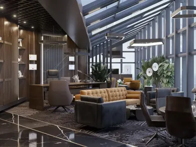
Measured plants make air and scale easier to read. Staff work in a more open volume; a visitor sees the same green at first glance. A pot with no care written down produces dust and neglect. Greenery is not a promise of a permanent client; it is a surface decision that sits in the right place.
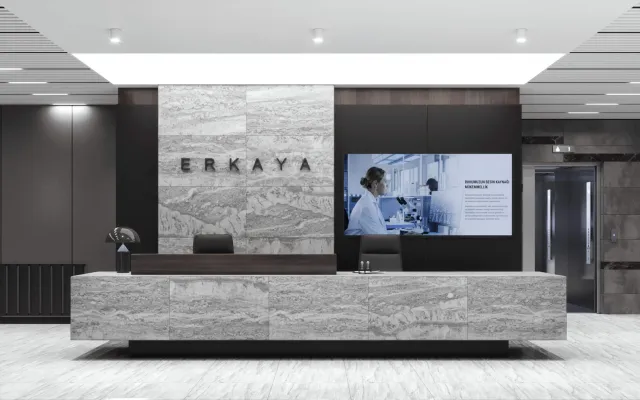
Current project: Turkish Pharmaceuticals


Kale Office
2. A wall that holds the eye
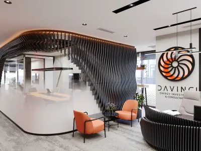
One wall surface — a timber rhythm, a large shelf, a calm cladding — can make the office read as considered without covering every plane. If a busy pattern, tile and a heavy shelf are used together, the room fills up. The wall is there as a plane for the eye to stop on, not to scatter a visitor’s attention.
3. Turning a large floor into an advantage
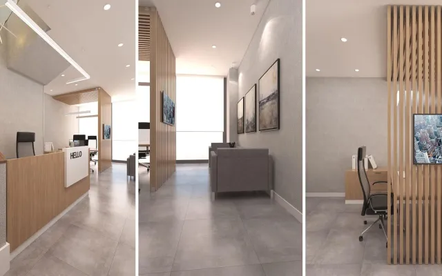
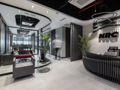
On a large floor, glass partitions and panels can open the volume; closing every room with a solid wall chokes it. Glass gives a modern touch, but privacy and acoustics still have to be written. On a small floor the same glass, used the other way, carries every conversation.
4. Geometric form
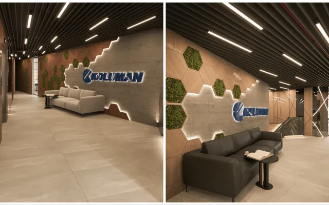
A geometric pattern adds life when it is held in the lighting, on one painted surface or in a single wall rhythm. Spreading the same pattern across every plane tires the eye. It is not sound to promise that a shape will raise staff output; the test is that the pattern does not fight noise and light.
5. A bold colour
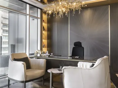
If wall colour stays in step with the furniture, it gives both the team and the visitor a clear language. A bold colour does not have to paint the whole floor; one wall or one seating group is enough. A mismatched palette produces clutter, not a focal point.
For a plan built with few pieces see minimalist office design examples.